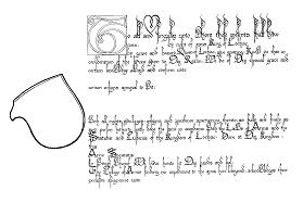
This award blank used in Lochac was designed by Master Thorfinn Hrolffsen (OP) and and represents the bastarde hand at the height of its popularity. The calligraphy in this scroll dates in style to around 1400 - 1450. Its use though continued way into the mid 1500's and was wide spread, prevailling on most if not all of the Continent as wenn as in England.
A precursor to this hand is to be found in the gothic textura hands popular in the 13th and 14th centuries. It was however, the large demand for manuscripts and books that brought about the downfall of its formal predecessor.
Volume demanded speed of execution, and in this regard gothic textura was far from satisfactory. A more cursive hand was needed that would serve with more functionality, and it was from these beginnings that this "bastard" derivative was born.
The hand is often referred to simply as bastarde which is a reference to its origins. Marc Drogin uses the term gothic littera bastarda (bastard gothic letters). It gained high use in the late 13th century and lasted as a source of penmanship for over 200 years. Note the high ascenders on the top line of th blank. In period, letters were frequently penned extremely high on the upper line of text. It enabled the scribe to lend decoration to the top of the page, frequently left blank due to the presence of an illuminated capital (such as we see here with Thorfinn's design).
It is imperative that the correct pen width is used here or the effect is ruined. This particular blank requires a very fine nib, myself having achieved near perfect compatibility with a 0.5 and 0.75 mm wide dip pen. In this particular piece, the letters are penned within 3mm wide lines, spaced 8mm apart. Follow these dimensions precisely.
If you are feeling particularly confident in your ability, rubricate (pen in red) the text for the name and blazon. If you do so though, make sure the medium you use is opaque. I recommend watered down gauche for this - it is much better than coloured inks. Finally, in our opinion, the final product looks nicer if you make the text for the name and device left aligned (ie in line with the rest of the body of the text). This is only personal judgement, so use your discretion.
There are two elements in the blank that need illumination. The capital "T" requires some thought. Firstly, try to stick with red, green and blue for colours and gold for the metallic look (gouche or leaf/shell), branching out to other variations after you've dome some more research on the style.
In this particular design there are a number of things that you can do for the background and capital
Background
Capital
If you're feeling adventurous and particularly artistic, fill the captial with a more cunning leaf design, but only after you've had a look at some period examples. The best way to get ideas is to match the hand with a period piece and go from there. I have also added other bits of illumination to this pre-printed, but I would recommend again that you do this only when you are really confident that what you are doing is authentic. Again, historical examples (preferably colour facsimiles) should be your only guide here.