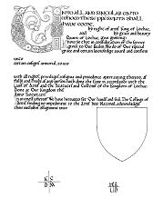
This award blank was designed by Mistress Myfanwy of Aberystwyth. As for the above design, the calligraphy is in the carolingian miniscule hand. I would place this particular design in the 9th century, when Charlemagne's influence in education and his encouragement of writing and manuscript production were still strong. Although Charlemagne dies in 814, his sons continued to commission beautiful books.
See the comments on the calligraphy above. The basic pen angle should be around 45 degrees, and the letters themselves should maintain alignment with the vertical
I do not know what pen was used to letter the original, but the 3.5 Mitchell is similar. Test the pen out on a scrap of paper to match as closely as possible. In this particular piece, the letters are penned within 4mm wide lines, spaced 4mm apart. Follow these dimensions precisely.
The illumination here is typical of the period, with a mixture of Insular and classic styles. Your choices of colours is fairly extensive, but again, some restraint should be used. I would recommend that you use predominantly red, green, blue and yellow. The acanthus leaf foliage could be shaded, but the overall effect should be of strong colours - not pastels. Gold was often used in this style in solid blocks or for the knotwork with bright colours filling the holes.