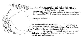
This AoA blank was designed by Master Frae Fitzalleyne in the style of a document from the early 16th century, based on several contemporary documents including Cardinal Wolsley's letter of Credence (1527), The Treaty of Windsor (1532) and the Election of Francois I to the Order of the Garter (1527).
Most formal documents of this time were not pieces of highly illuminated artwork, but were well executed pieces in a formal hand, with the decorative elements drawn with the pen, rather than painted with a brush.
The calligraphy is a simplified version of German Batarde, based on the Prayerbook of the Emperor Maximillian (1513). The hand is quite compact, with the letters closely spaced - only a pen width apart.
The fill-in text should be in black, or possibly rubricated (see the comments on the Bastarde design). Fill in text should be left justified - don't centre it in the blank space or use any fillers.
In this piece, the letters are penned within 5mm wide lines, spaced 10mm apart. Follow these dimensions precisely. Ascenders and descenders rise and fall half the minim - about 2.5mm each way. Words are spaced about a "o" apart. The basic pen angle should be around 45 degrees, and the letters themselves should maintain alignment with the vertical.
The scroll was lettered with a William Mitchel size 4 nib, but any similar pen width should be suitable. Test the pen out on a scrap of paper first if you are unsure.
The large scrolled capital would usually be filled in solid black. Red or metallic gold would also be options, if they compliment the device.
If you are feeling artistic, you could enhance the capital and the space around the shield by filling in with very delicate pen drawn foliage and flowers - a further example of the elaborate penwork found in this period.
If you are really artistic (Frae says "insane") and have too much time on your hands, you could add naturalistic people and animals to offset the foliage or even support the capital, in the style of Durer.