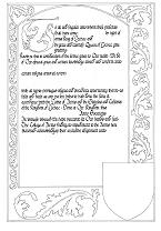
This blank was designed by Master Frae Fitzalleyne, based on a number of late 15th century Flemish Books of Hours. The illumination can be completed in either a Flemish style or a contemporary French style - both options are described below.
The hand is similar to those in the Document and Bastarde designs, but is based on the batarde hand in the Hours of Mary of Burgundy (c 1477) found in the Osterreichische Nationalbibliothek, Vienna.
The calligraphy on the blank was penned with a size 4 William Mitchell nib, with a basic angle of 45 degrees to the vertical. The letters are penned within 5mm wide lines, spaced 10mm apart. Follow these dimensions precisely.
The fill in text should be left justified rather than centred and should be in black.
Capital
Border
Interesting combinations include gold and white foliage on grey background; gold foliage on black background; multicoloured foliage on a deep red or blue background. Go wild - the overall effect should be deep and rich.
Capital
Border
The overall effect is lighter and more delicate than the Flemish treatment.