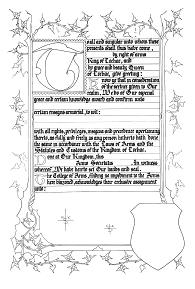
This award blank used in Lochac was designed by Master Richard de la Croix and is typical of MS of the 14th century. In actual fact, the ivy border has been taken from MS Adul 22,145 held in the (now former) British Museum. This piece dates to around 1350, and is in design at least very much consistent with the dating of the illumination, as the versals which appear at the start of the paragraphs. This style of illumination and calligraphy was also geographically quite widespread occurring in both England and on the Continent.
This is an example of the gothic textura quadrata hand already discussed above. I consider it represents the pinnacle of Medieval writing, and is a formal, rigid and very space conscious hand. Angularity of line and the compressed form of lettering evident in the script reduces the overall readability of the text. This was deliberate as scribes strived to accentuate the form of the word rather than that of its component letters. Scribes had already started this process with Early Gothic, and this was the evolutionary result of this trend.
The Gothic Textura script became extremely popular in the 13th Century, and remained this for the duration of much that is the Medieval era. It was also the model for much of the first printing of the 15th century.
The calligraphy on the blank was penned with an Osmiroid "B2" at a basic angle of 45 degrees to the vertical. The letters are penned within 5mm wide lines, spaced 4mm apart. Follow these dimensions precisely.
For the particularly daring, rubricate (pen in red) the text for the name and blazon. Start all the fill-in text left aligned with the rest of the wording. With the spaces remaining after the text for the name and device you may care to add some illumination to fill the space to the right margin, but look at some examples first.
As with the Italian blank, the colour scheme here is very rigid. The leaves should be red, blue or gold. Specifically leaves not suspended from solid vines should always be gold. The others, you can alternate in colour between red, blue and gold. Ivy leaves not done in gold should be shaded slightly with white from the centre or the tips. Likewise the vines and stems should be blue or red, with a thin white line down the centre. The rest of the border should also be gold or coloured red or blue, even partitioned in sections of each. If you decide on using red and/or blue for either of the two vertical or the bottom horizontal border, overlaying thin white lines with geometric or repetitive patterns to fill the space is perfectly acceptable.
In this particular design there are a number of things that you can do for the capital "T"
Background
Capital
Versals
Because of the prevalence of this style of illumination this is one of those cases where you should spend time looking at any of the numerous examples available. Despite the limit on the colour range, there are many things that can be done, including complex diapers for the capital, and very ornate patterns of white line work on the thin border.