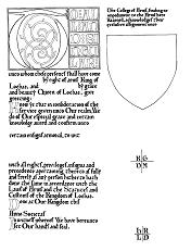
I believe this design is the work of Master Richard de la Croix. The calligraphy is in an early gothic style, which was an adaption of the earlier Carolingian Miniscule and was popular in the 11th and 12th centuries. The illumination is more typical of the 13th century, although earlier examples can be found. especially in Europe.
The calligraphy on the blank was penned with an Osmiroid "B2" at a basic angle of 45 degrees to the vertical. The letters are penned within 4mm wide lines, spaced 4mm apart. Follow these dimensions precisely.
As with the Late Gothic blank, the colour scheme here is very rigid and is basically restricted to red, blue and gold. It does, however, produce and very impressive result and looks very rich. The best result comes from the solid blocks of red and blue, lightened by diapering and highlighted with gold. It is worth using a good gold here or leaf gold (even the imitation leaf looks great).
Scheme 1
Do the fine border around the Capital letter block and all the small borders within in gold. The capital T and the rest of the intro text are also in gold.
Complete the background outside the capital in either red or blue, and use the other colour inside the T.
Complete the blocks around the first line of intro text in red or blue, and fill inside the letters with the contrasting colour. Reverse this scheme for the next block and so on.
Now diaper the blue and red areas around the T and draw fine white lines around the letters and lining the blocks to the right.
Capital
Versals
Many of the comments on the Late Gothic blank apply here too. Despite the limit on the colour range, there are many things that can be done, including complex diapers for the capital, and very ornate patterns of white line work on the thin border.