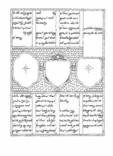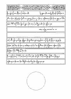
This award blank was designed by Mistress Rowan Perigrynne based on several 16th century Persian manuscripts. The general design is based on pages from the collected works of 'Ali Shi Nawa'i (c 1527) and the decorative patterns are drawn from paintings by Khamsa of Nizami (c 1540) and ither contemporary artists. In fact, the style of Persian manuscripts changed very little over the preceding centuries, making this design suitable for eastern personas from many eras.
The text is a new hand based on the letterforms in the above manuscripts. It is designed to look like Persian script until you try to read it, when it is legible as English (well most people can figure it out without too much trouble). Please feel free to use it in any relevant work, with appropriate acknowledgment.
The calligraphy was penned with a size 3.5 Mitchel nib at a basic angle of 45 degrees. The basic text lines are 2.5 mm high, spaced 10mm apart, with ascenders and descenders up to 5mm each way. You should find it easy to draw lines across from the existing text.
The text should be completed in black ink - no rubrication or gilding was used. Due to the flexible nature of the hand, you can stretch of compress letters (especially e, c, and u) to fit the space better. Try to fill each line completely. There are no capitals to worry about - all letters are lower case form.
Unlike some other AoA blanks, you have a lot of freedom with the colours, as long as you stay with rich bright tones. The Persian miniatures resound with many bright colours, all clamouring for space on the page. You want to create a very rich tapestry effect. The most common colours are blue, green, red, gold, black, hot pink and green (malachite). You might also see orange and purple in smaller amounts.
Here are some specifics and suggestions:
Borders
Arabesques (These will have the seals in them)
Device frame
Patterns
If you need more inspiration, think of a Persian rug - only brighter.
